would enable you to enjoy an array of other services such as Member Rankings, User Groups, Own Posts & Profile, Exclusive Research, Live Chat Box etc..
 Latest*


The Darvas box theory is a momentum strategy for use with a short-term trading style. When I saw short-term, I don't mean day trade, although I suppose that is possible as well. I mean short-term in the sense that one tends to hold the stock for less than a year. However, the exit points are not very well defined by Darvas. His only remark is that he sells when the stock penetrates the box to the downside. Seems clear enough, I guess.
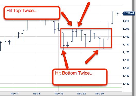
At its core, the Darvas box theory system is ludicrously simple: All one needs to do is read and understand the price action of a stock! Watch for the price of a stock to form a 'box', with a lower bound and an upper bound. When, like a set of pyramids, the boxes pile one on top of another, the opportunity to buy occurs when the stock penetrates the uppermost part of the topmost box.
According to Darvas, the stock could bounce around inside the box as long as it liked; he would not buy it unless it penetrated the uppermost box. In fact, he stated that he would be concerned if the stock did not bounce around. Darvas graphically shows this idea on page 189 of his book. However, Darvas himself claimed never to have charted a single stock. He called himself a mental chartist.
A Darvas box is basically an area of consolidation. For whatever reason, the market has decided the stock should neither advance nor decline appreciably, but rather idle sideways. When I chart, I prefer to use bars rather than lines, for the simple reason that the line chart is not precise enough. In his telegrams, Darvas requested high, low, and close for his stocks, so at a minimum that is what we need as well.
On a bar chart, I tend to think of the (weekly) prices within the box as a set of toothpicks. Each individual toothpick can and should be of various sizes. However, once a box has been identified we can draw two horizontal lines: one for the resistance at the top (located at the upper price for the box) and one for the support at the bottom (located at the lower price for the box).
http://www.boxcharts.com/darvas-box-theory-explained-1.html